 Roman Type
 is a one-person foundry based in Berlin and run by type designer, typographer, writer and educator
Roman Wilhelm. All of the families published under this label can be licensed by following the links mentioned below.

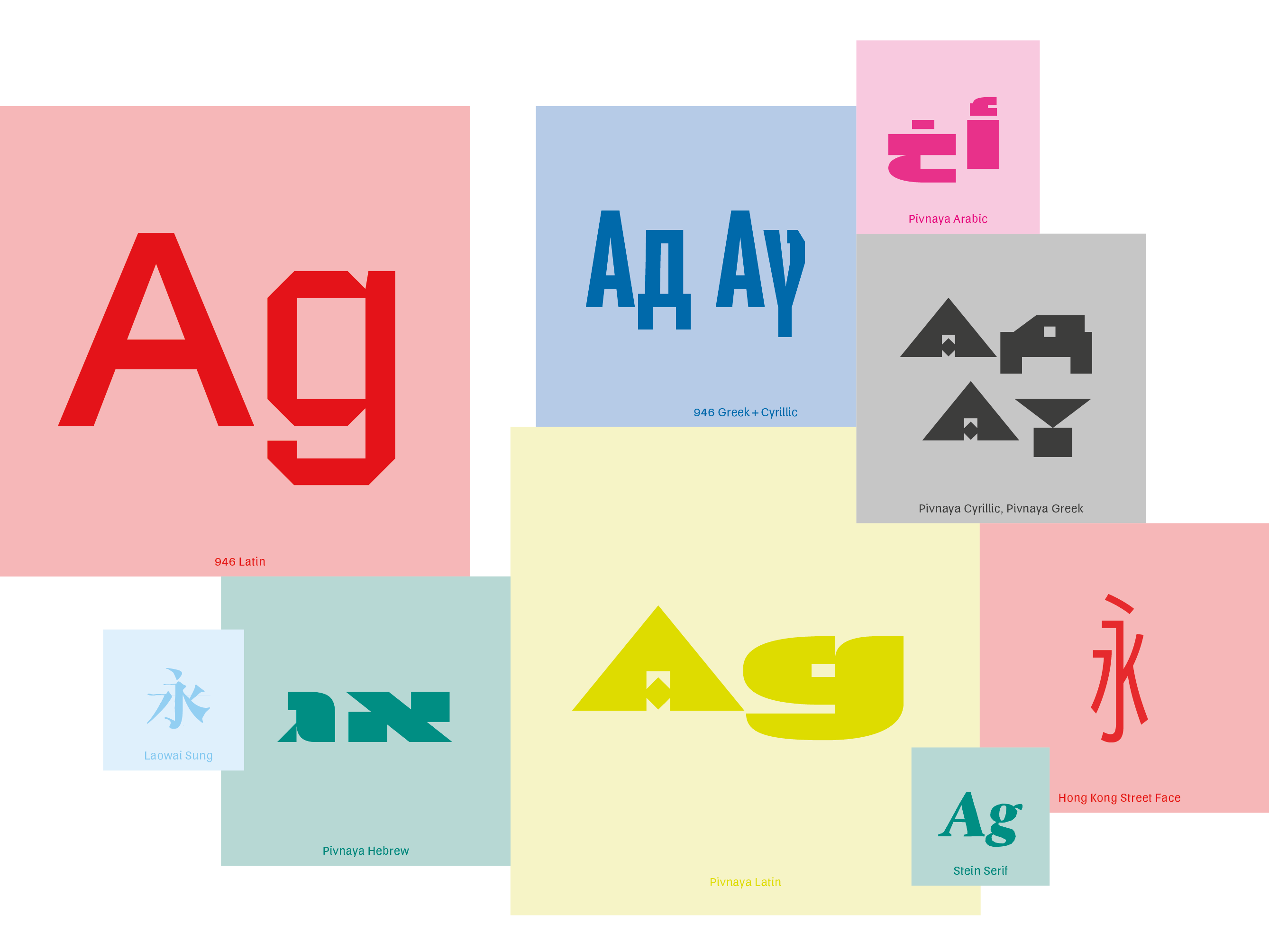
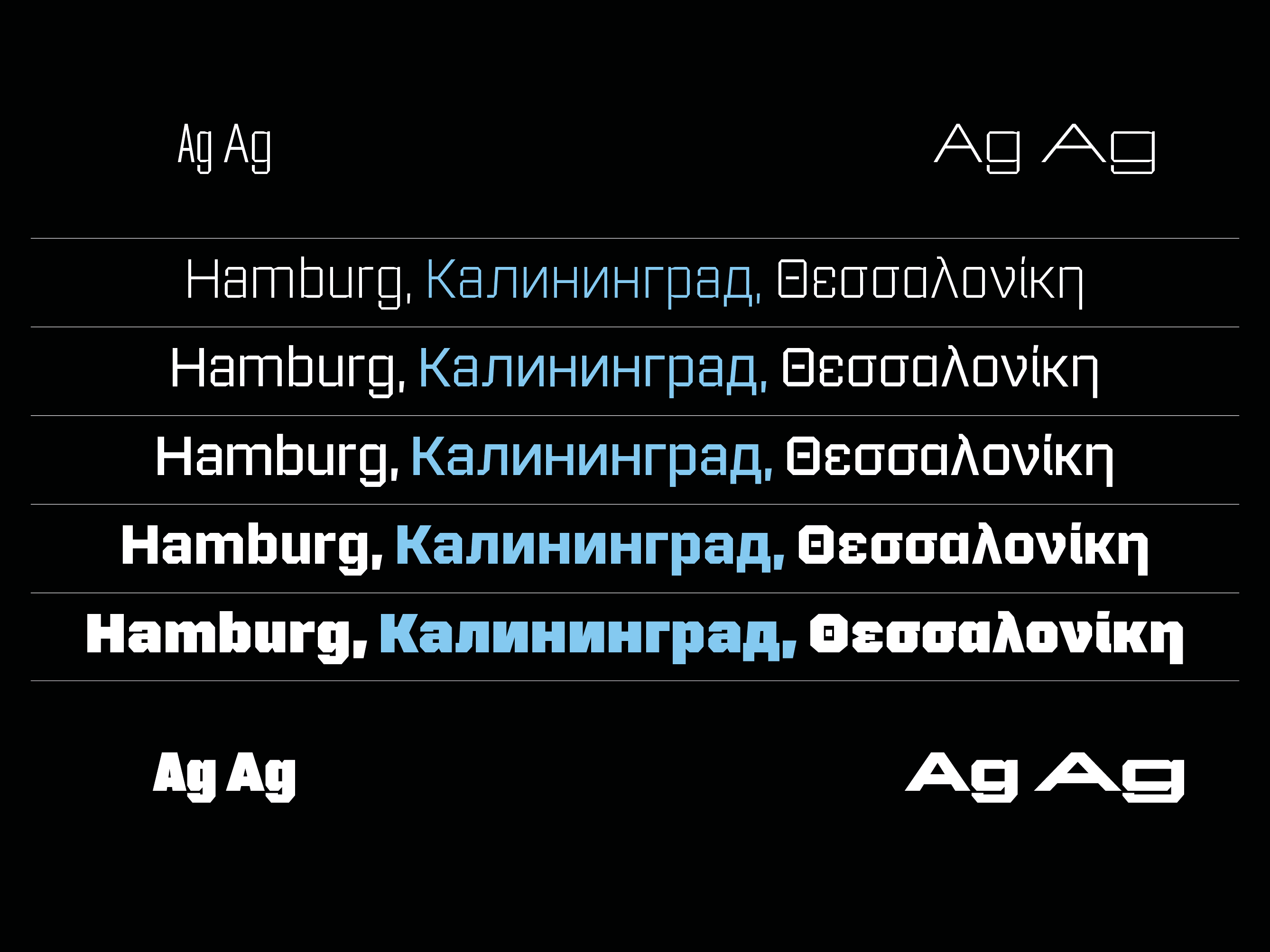
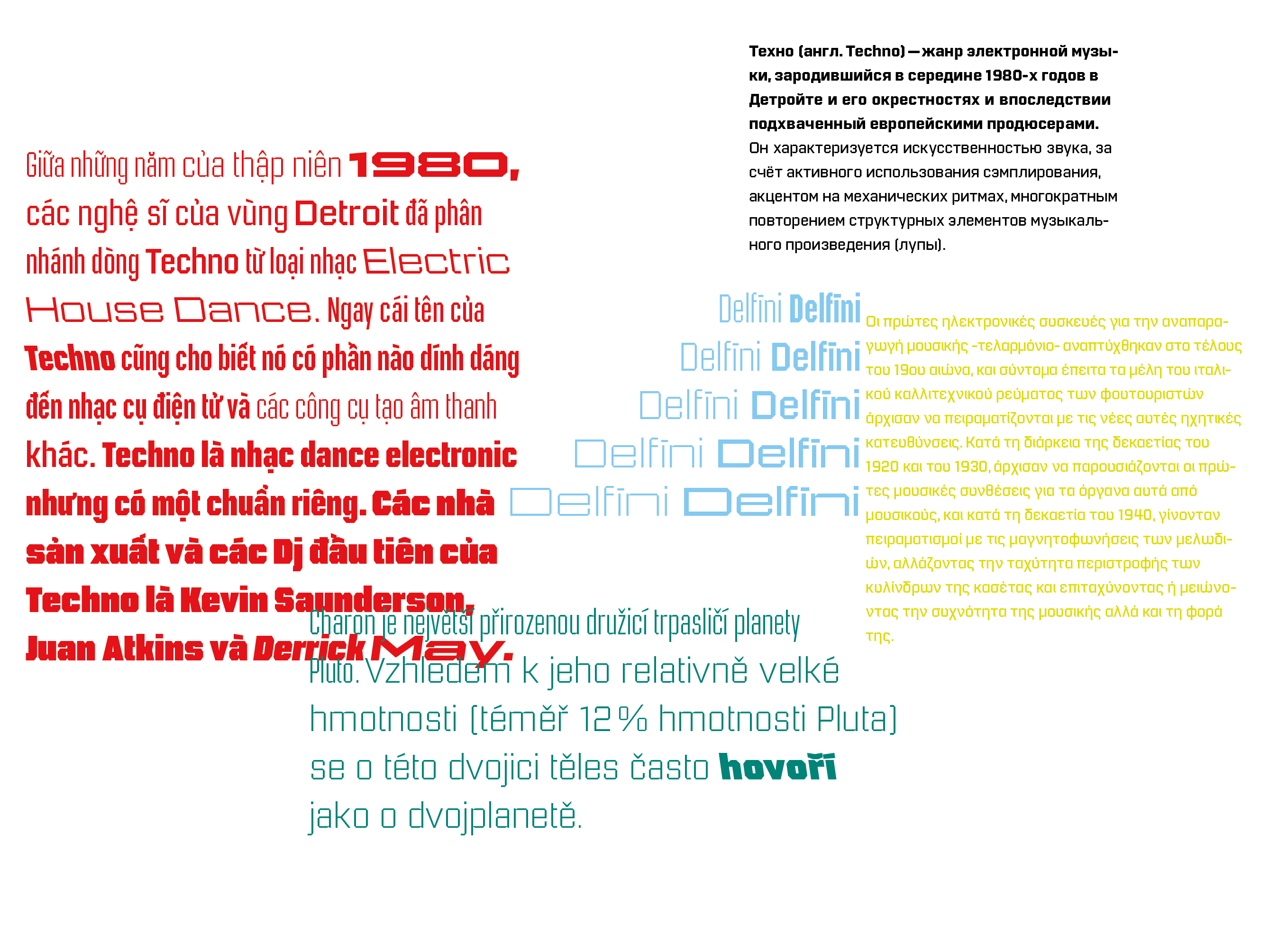
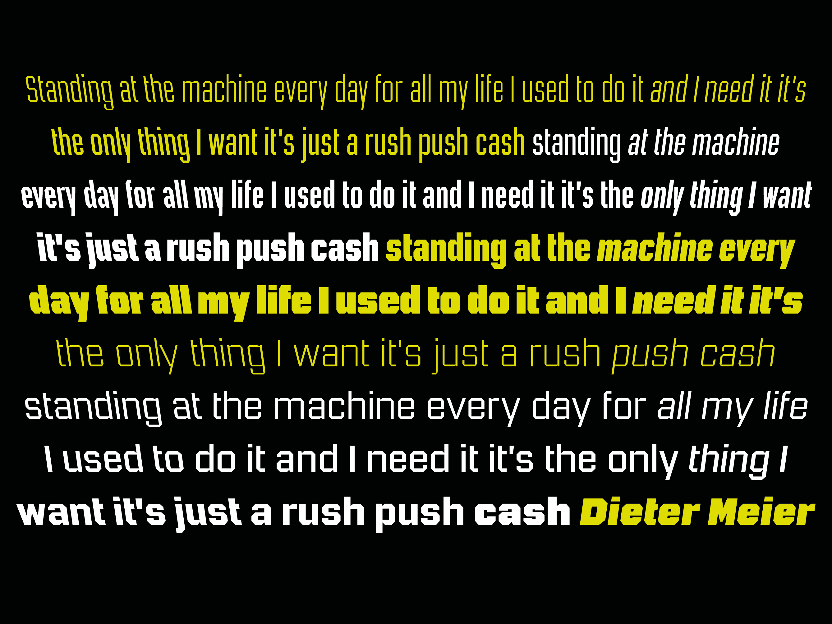
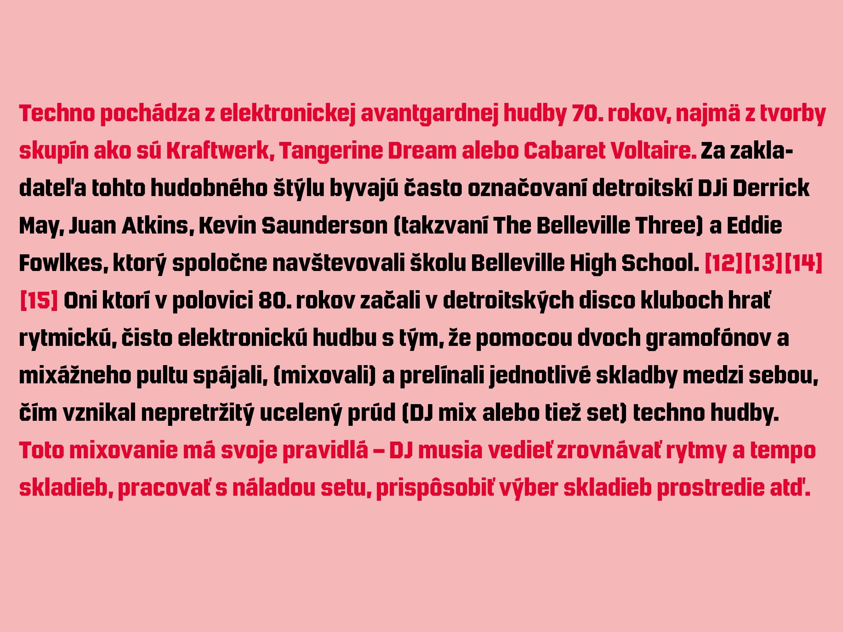
946 is a multilingual techno-style family. While more and more text families have recently been extended to a multilingual and multi-script level, not so much attention has been given to the more decorative styles. The 946 family does exactly that. A lot of care has been given to the various diacritics: they were designed a little more brutal, a little more European than with some other fonts of this category. Do also watch out for the non-Latin legs of this family.
946 is inspired by electronic music. When Roman found a second-hand Roland TR-606 drum machine in a store in his hometown back in 1995, he started to hang out with would-be DJs and musicians, trying to play the beats that went around the globe. When he started to study visual communication three years later, he was assigned the matriculation number of 946, which has now become the name of this family.
Language support: Afrikaans, Albanian, Catalan, Croatian, Czech, Danish, Dutch, English, Estonian, Finnish, French, German, Hungarian, Icelandic, Italian, Latvian, Lithuanian, Maltese, Norwegian, Polish, Portuguese, Romanian, Slovak, Slovenian, Spanish, Swedish, Turkish, Vietnamese, Zulu, … Do also watch out for the other script versions of this family!


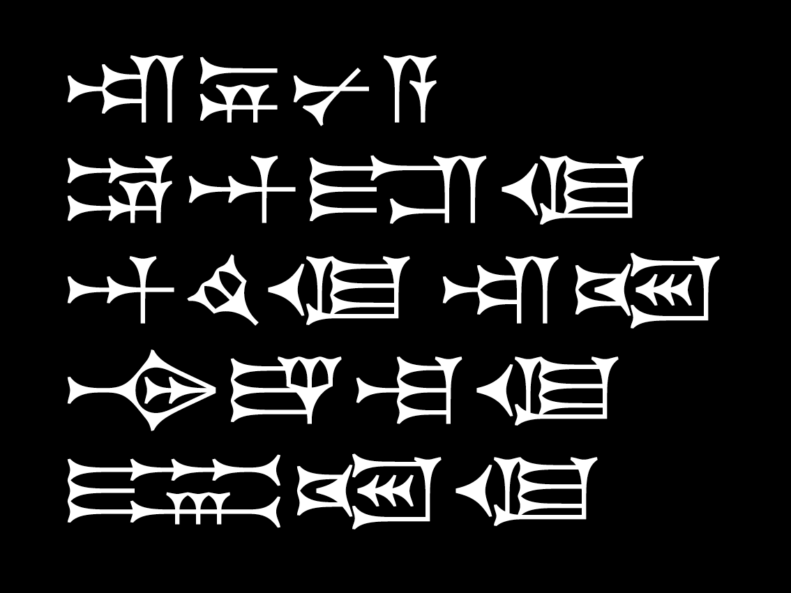
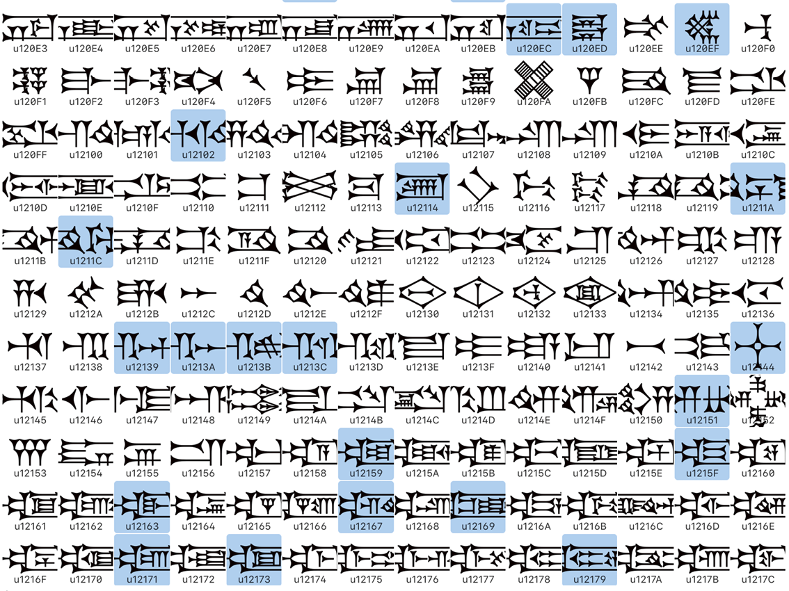
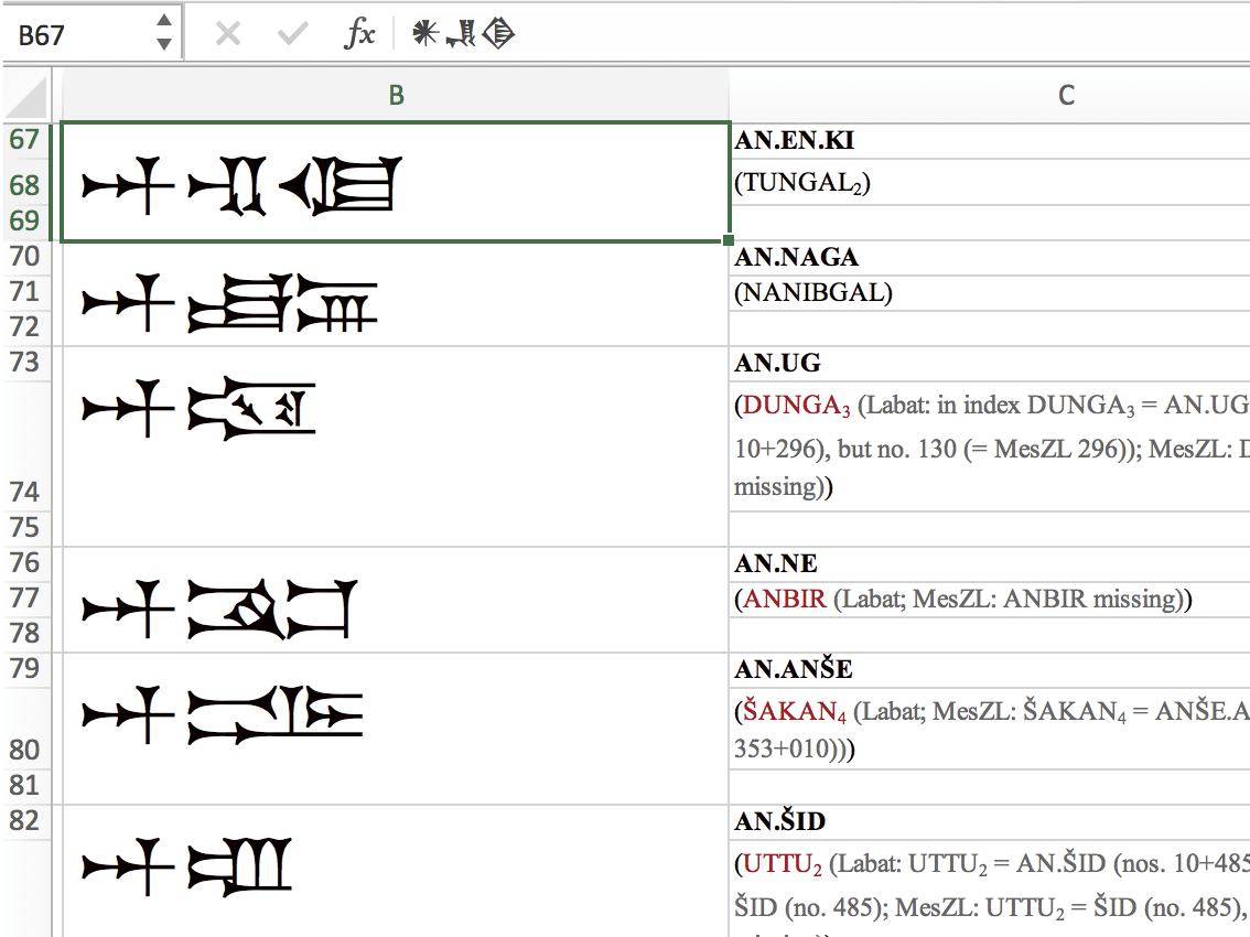
Times New Akkad is a multilingual Cuneiform family covering the Unicide signs as well as those listed in MesZL (Borger: Mesopotamisches Zeichenlexikon) and other sources. The first leg of the family is designed in Neo-Assyrian and Neo-Babylonian style. Another leg in Old Babylonian (respectively, Ur-III) style will follow in the future.
Times New Akkad will also feature everything you need for decent Latin transscription, as well as Greek, Arabic, Hebrew, Aramaic and Syriac. I hope to work closer together with the world of science, contact me for more information if you are interested!
Contact me for licenses! This family will be free!
N.N.
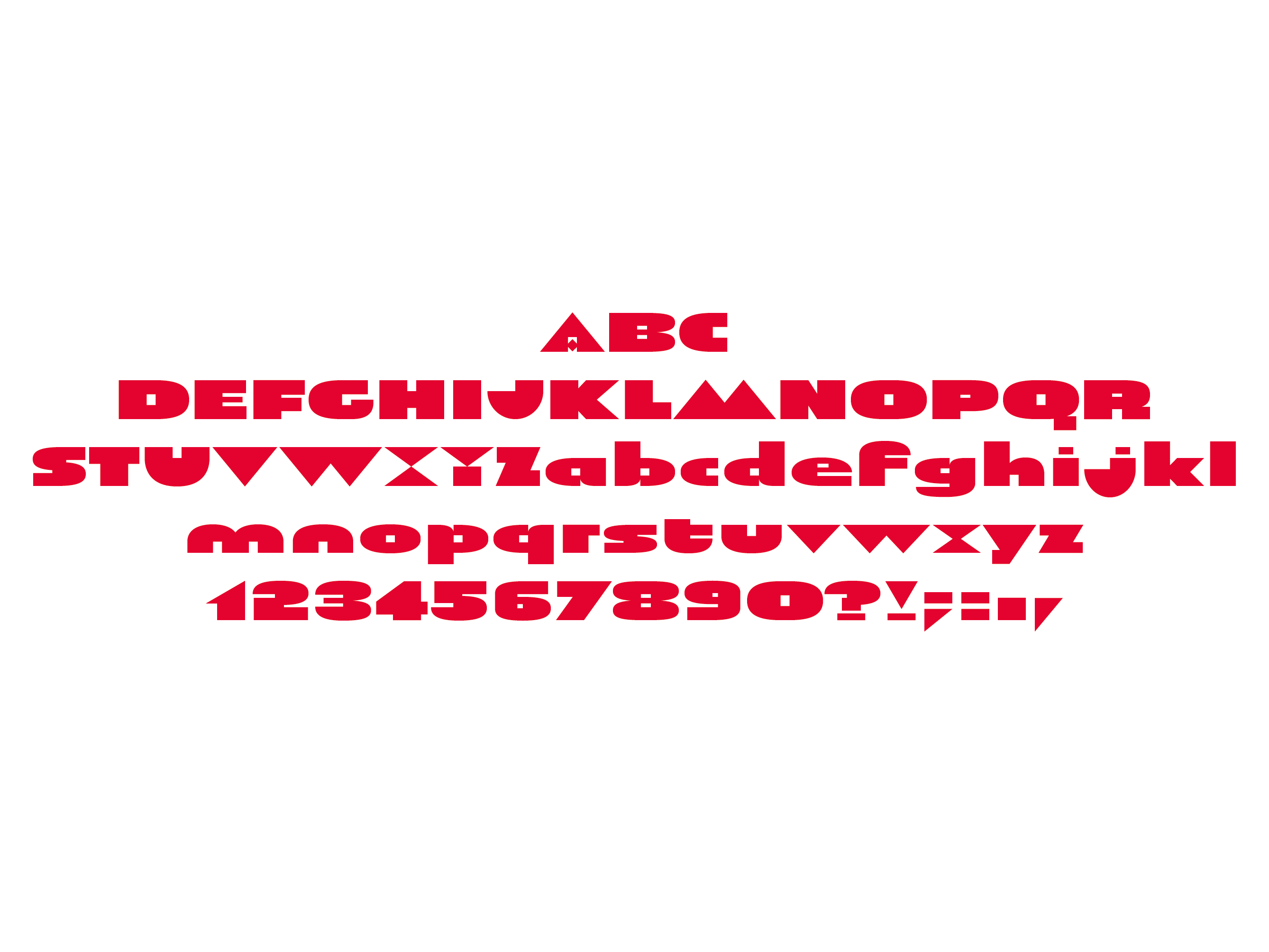
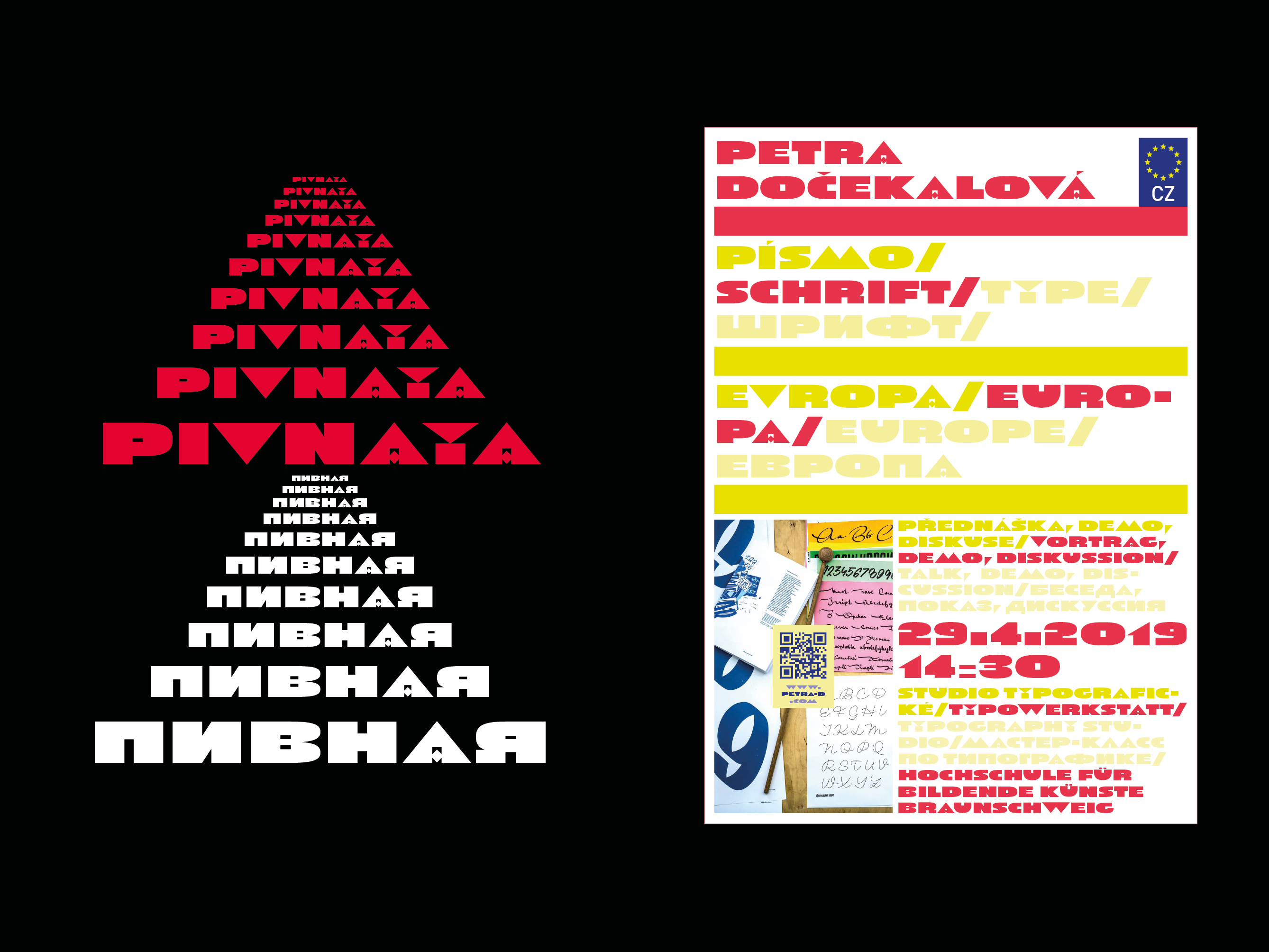
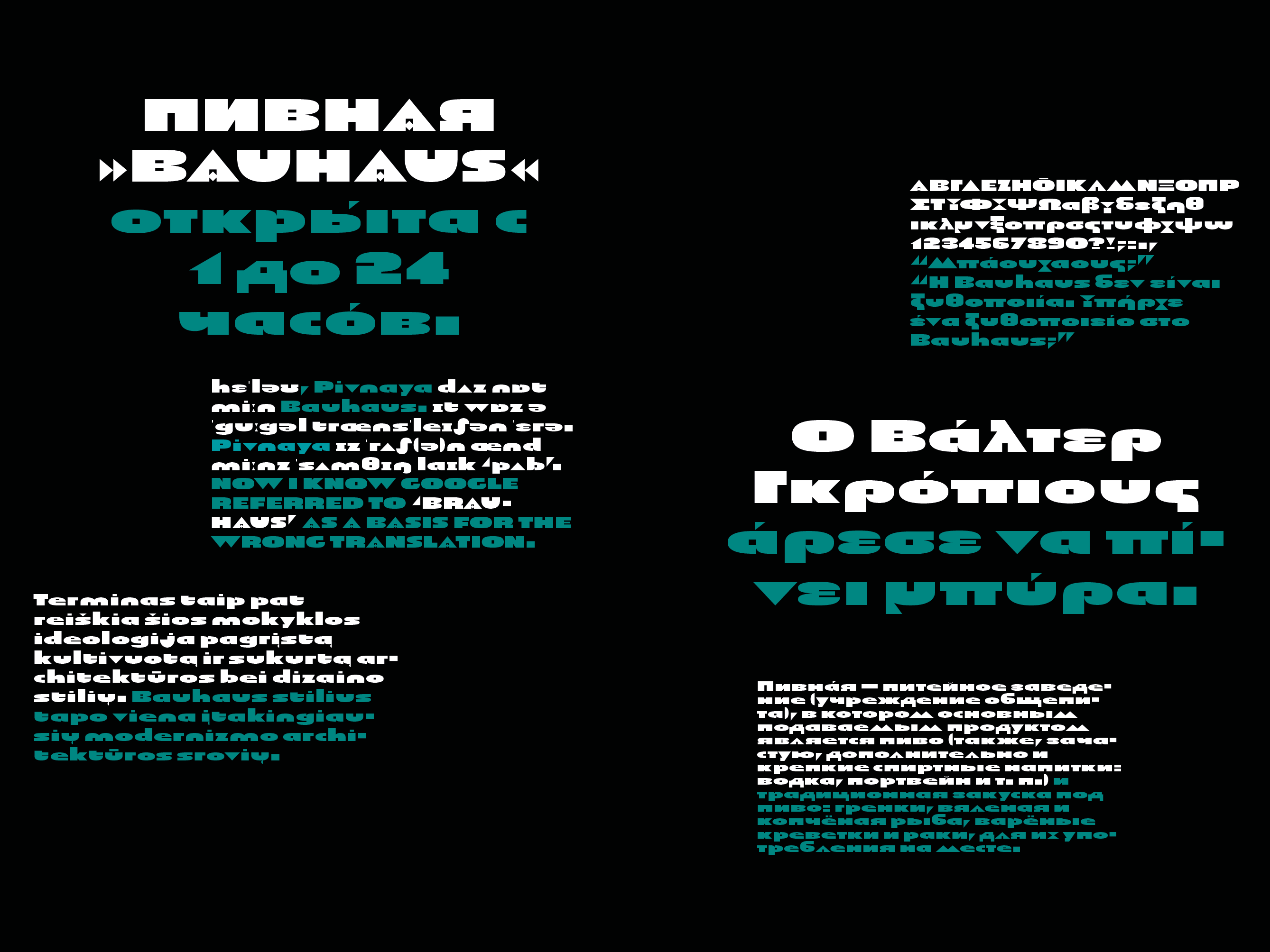
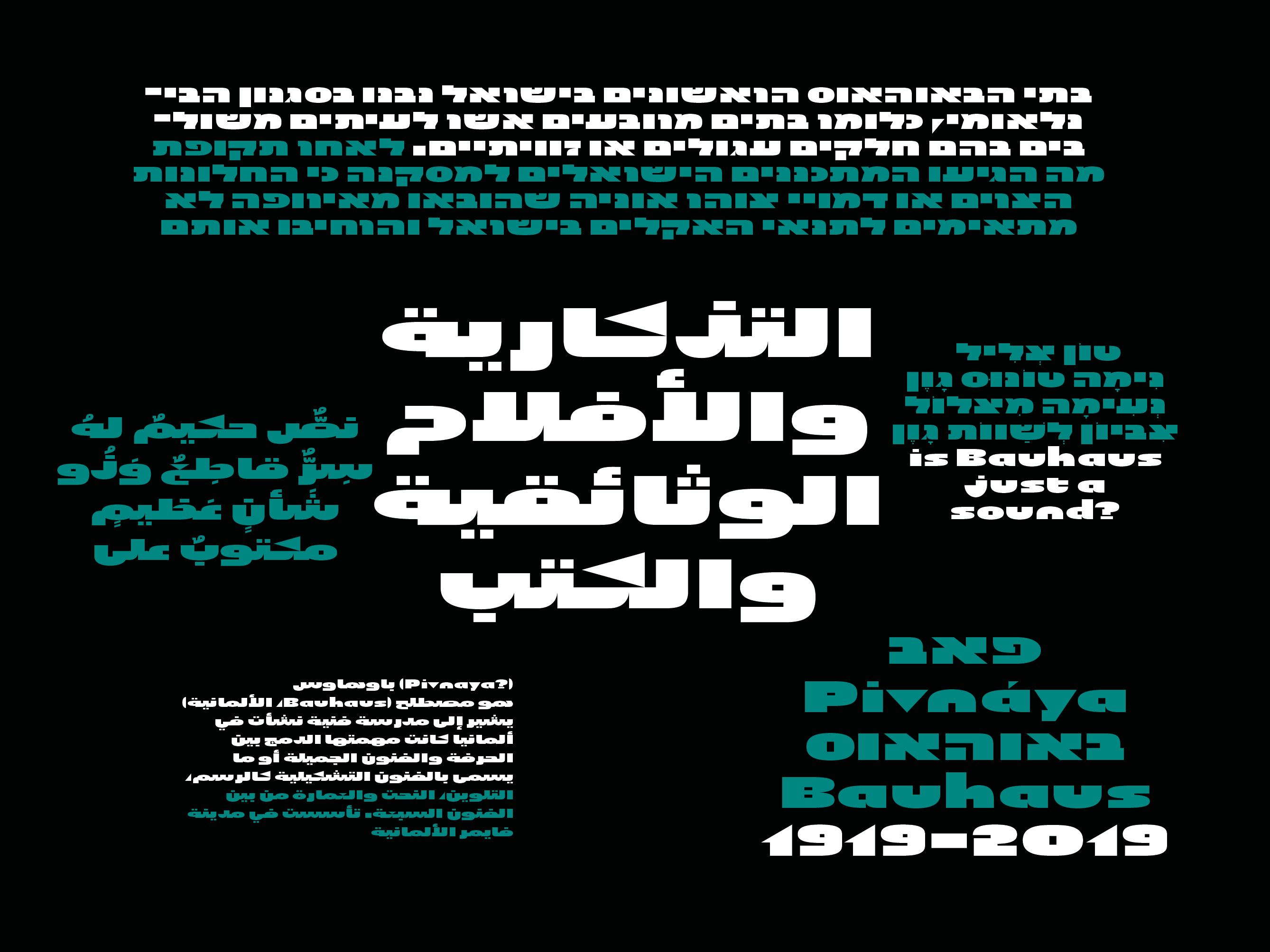
‘Pivnaya’ means ‘bar’ or ‘brewhouse’ in Russian. Initially designed for a poster, the family quickly turned multi-script. In 2019, the global design community was busy celebrating the centennial of Bauhaus, silently triggering the question as to if or how the phenomenon matters in the lives we lead today, or whether it could rather be reduced to mere historic purposes. At that point, I found myself falling into the Bauhaus trap myself, preparing a typeface design workshop for a group of Lithuanian and Russian students. But by a typing error, I accidently made Google translate ‘Brauhaus’ (brewhouse) instead of ‘Bauhaus’. That is why I called this family ‘Pivnaya’ in the end.
Pivnaya Latin works for: Afrikaans, Albanian, Arabic, Azerbaijani, Belarusian, Bosnian, Bulgarian, Catalan, Croatian, Czech, Danish, Dutch, English, Estonian, Farsi, Finnish, French, German, Greek, Hebrew, Hungarian, Icelandic, Italian, Latvian, Lithuanian, Macedonian, Maltese, Norwegian, Ossetic, Polish, Portugese, Romanian, Russian, Serbian, Slovak, Slovenian, Spanisch, Swedish, Turkish, Ukrainian, Urdu, Uzbek, Vietnamese, Zulu. Though being a decorative font, the International Phonetic Alphabet (IPA) increases usability for all kinds of purposes.


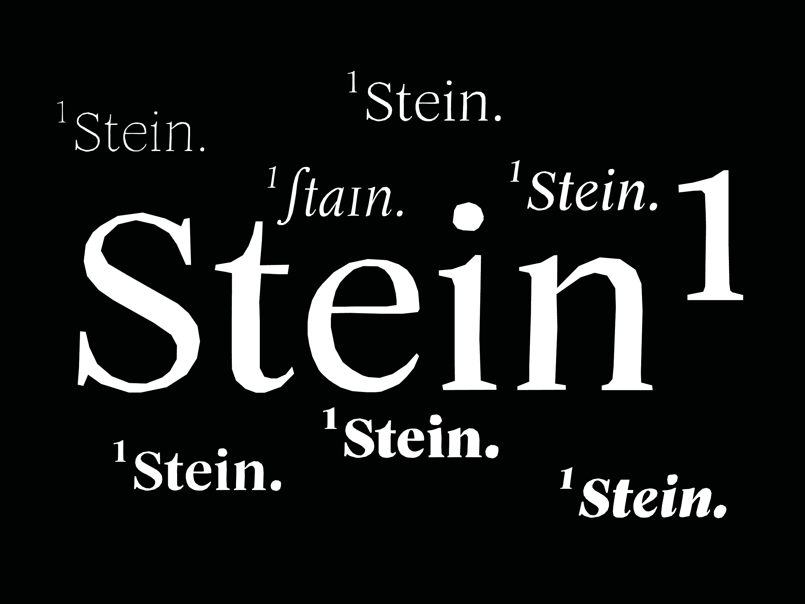
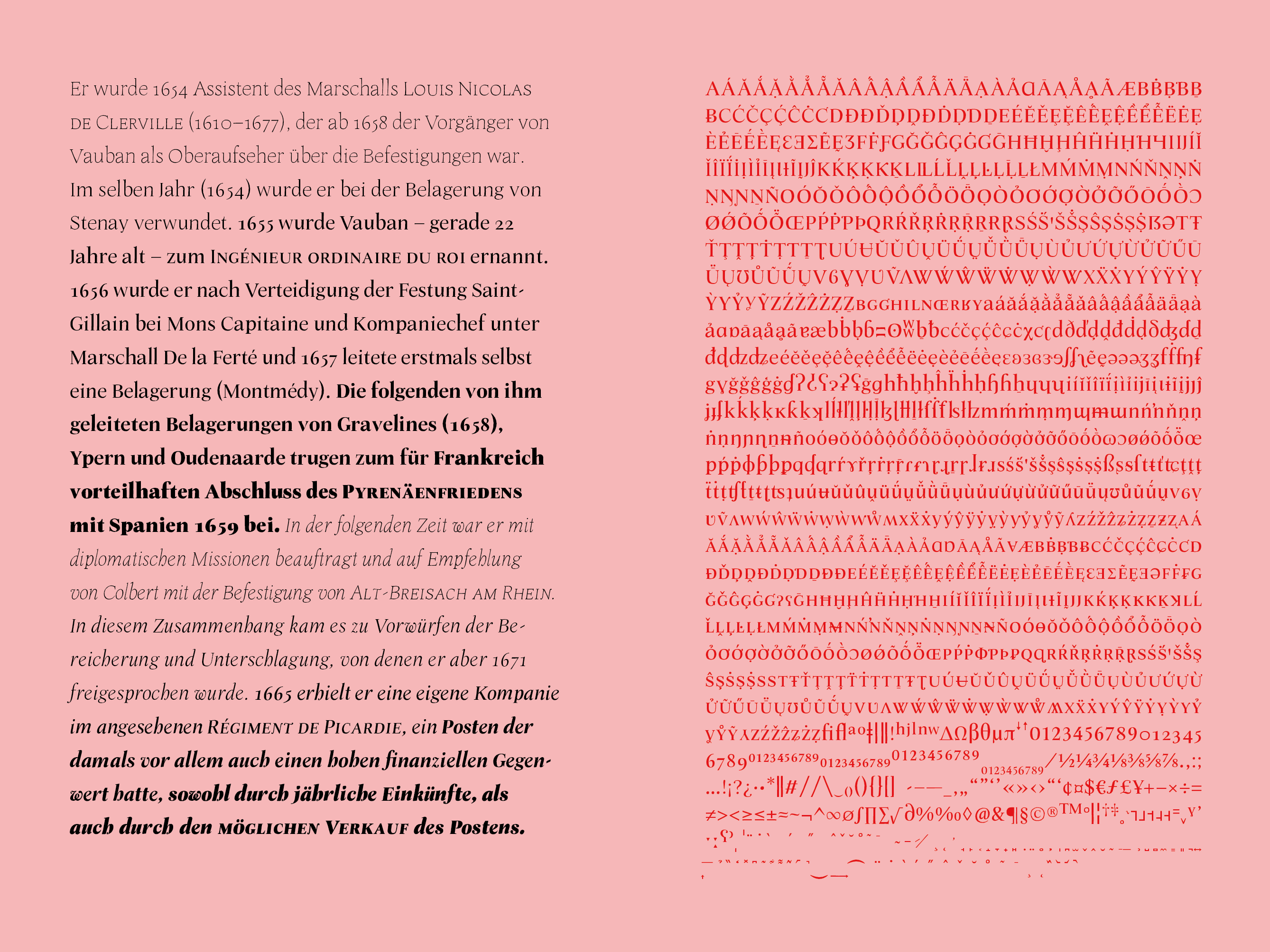
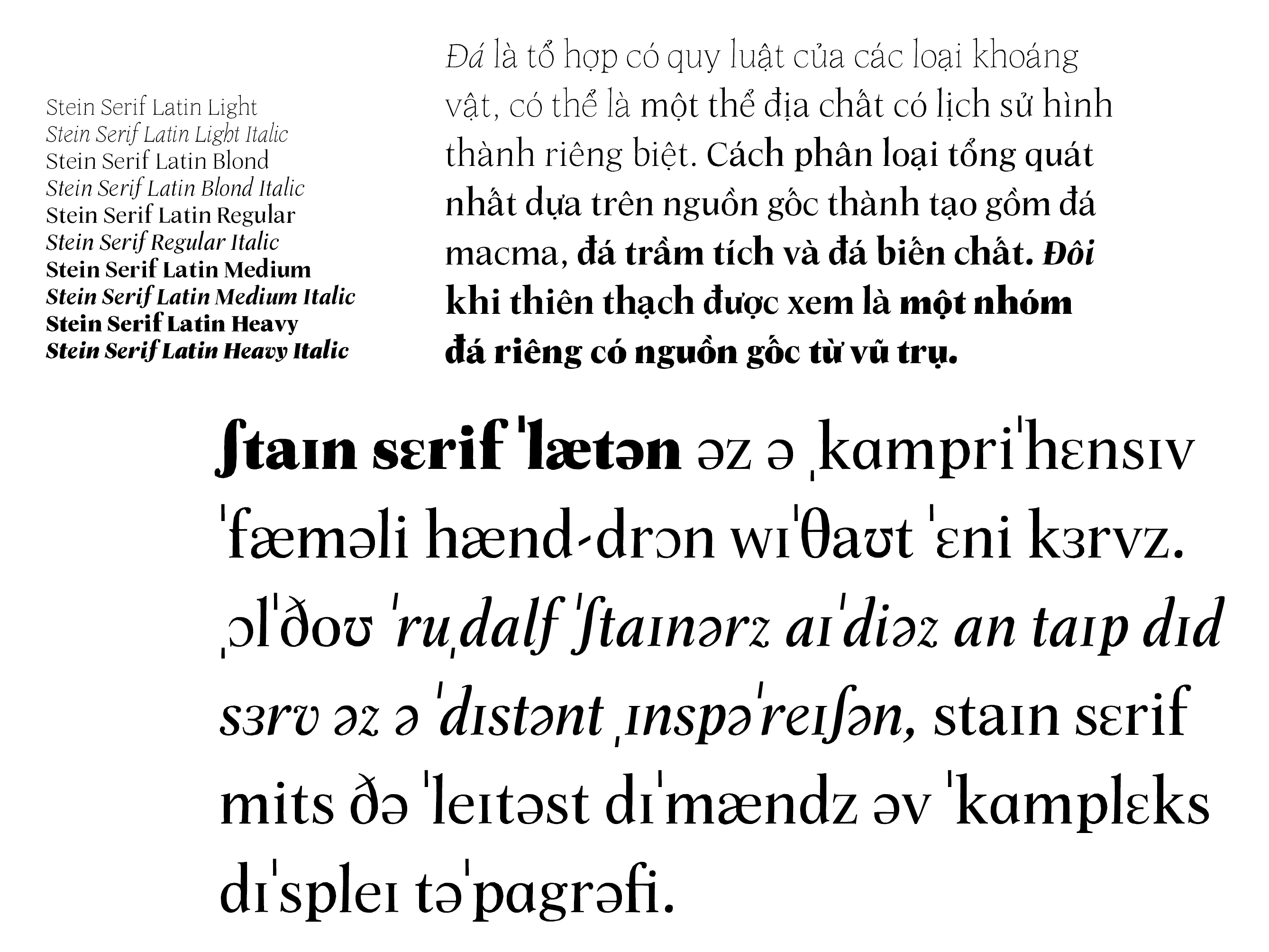
Stein Serif is a comprehensive family hand-drawn without any curves. Although Rudolf Steiner’s ideas on type and lettering served as a distant inspiration, Stein Serif meets the latest demands of complex display typography. Stein Serif Latin is the next family to be published as of Spring 2020, but there will be more, more.


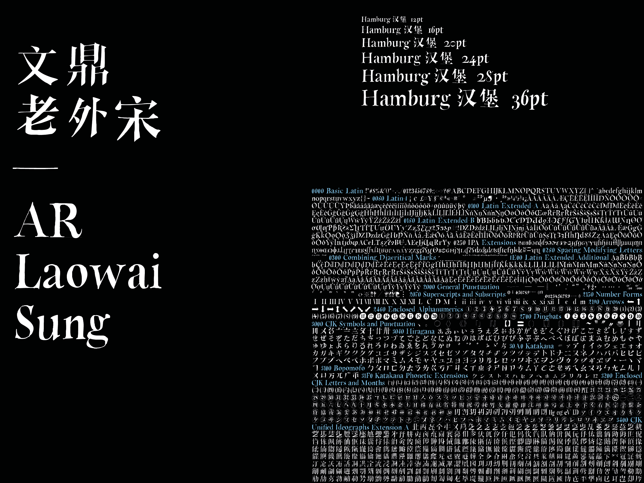
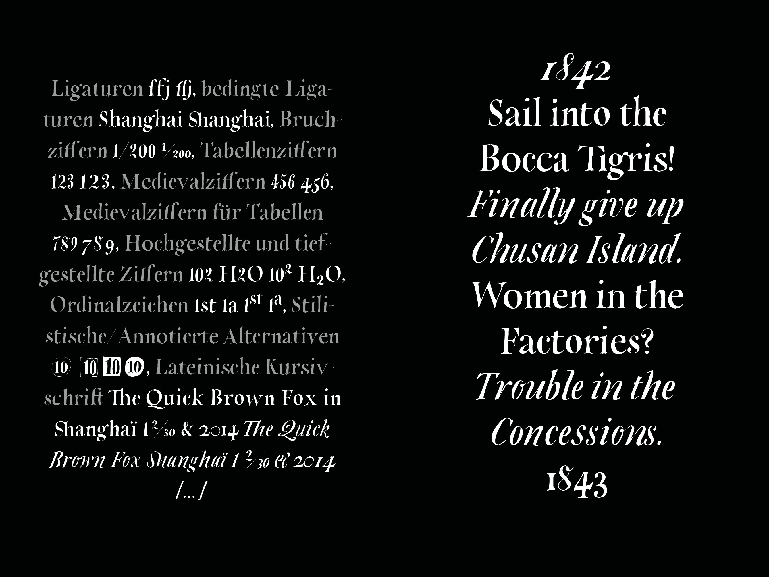
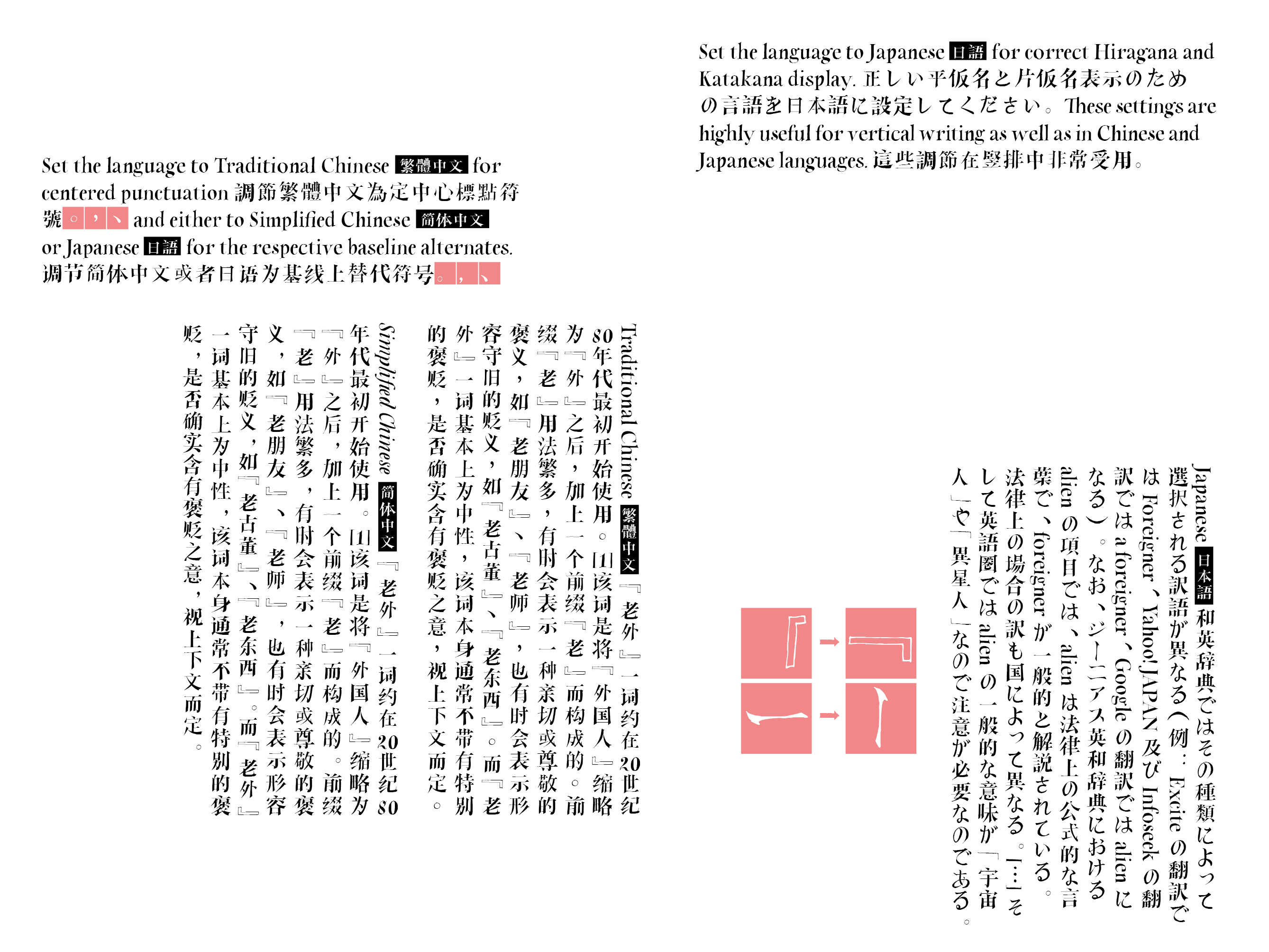
Laowai Sung is Roman Type’s first complete Chinese font. ‘Laowai’ means ‘foreigner’ in Chinese. But I would rather call that a nickname. Literally translated, it means ‘Mr. Outside’, and that is indeed a beautiful word! When Roman first came to China in 2002, one of his first Chinese words was Laowai. No wonder, with all the passers-by keeping on whispering it on the street. However, the word also makes clear you will always be an outsider in a way. Nonetheless, or perhaps just because of that, I kept on learning as much Chinese characters as possible, improve my spelling, learn calligraphy … the more you learn the less confident you feel.
After several abandoned attempts, I started to hand-draw my own Chinese typeface, 40 characters per page of a Moleskine notebook and began to call it Laowai Sung. The handmade look matches exactly the way I draw Chinese characters, respecting (or using) my own technical and aesthetical limitations.
In 2015,
Laowai Sung, counting more than 33 000 glyphs, was finally published by
Arphic (Taiwan) as an integral part of the Arphic Design Collection and their unique web font service
Arphic iFont Cloud. Also check out
AR Laowai Sung as presented in the Arphic portfolio.


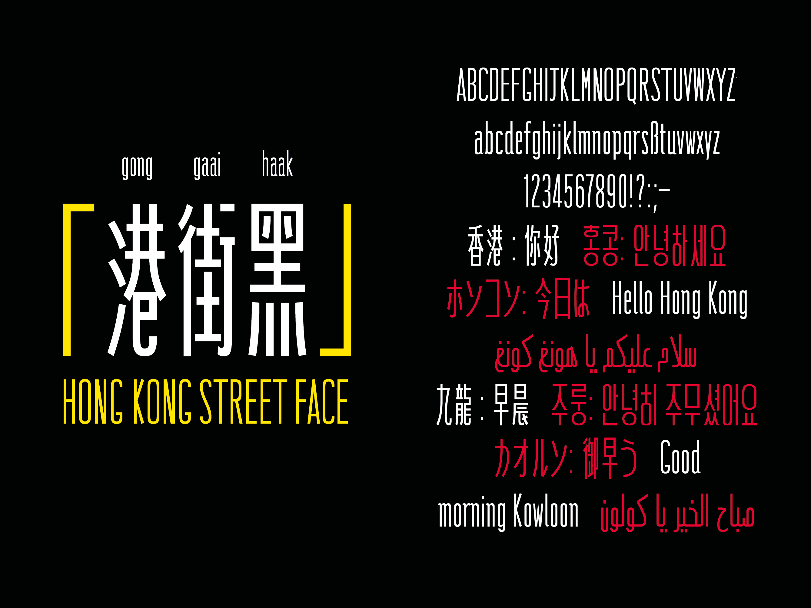
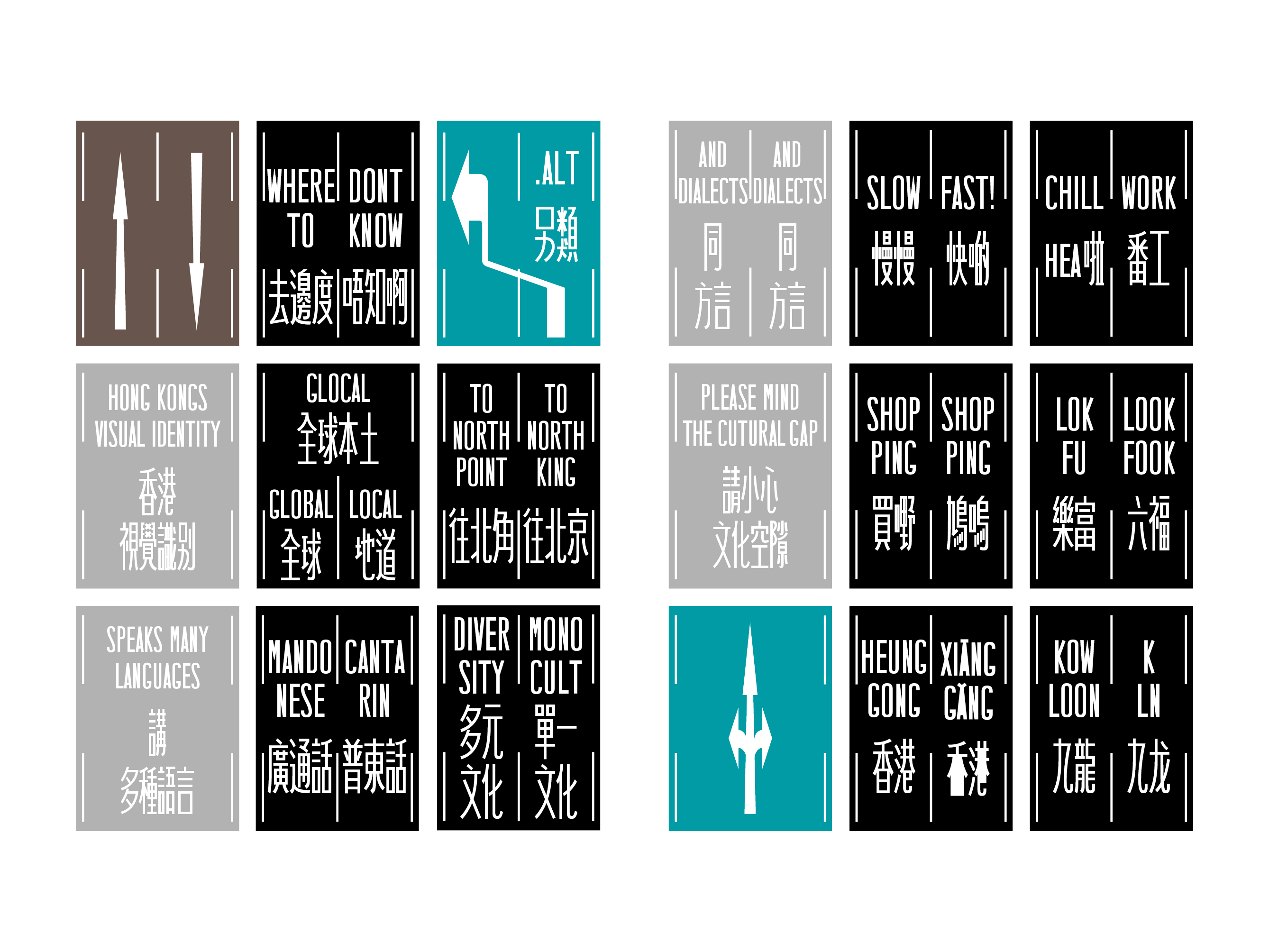
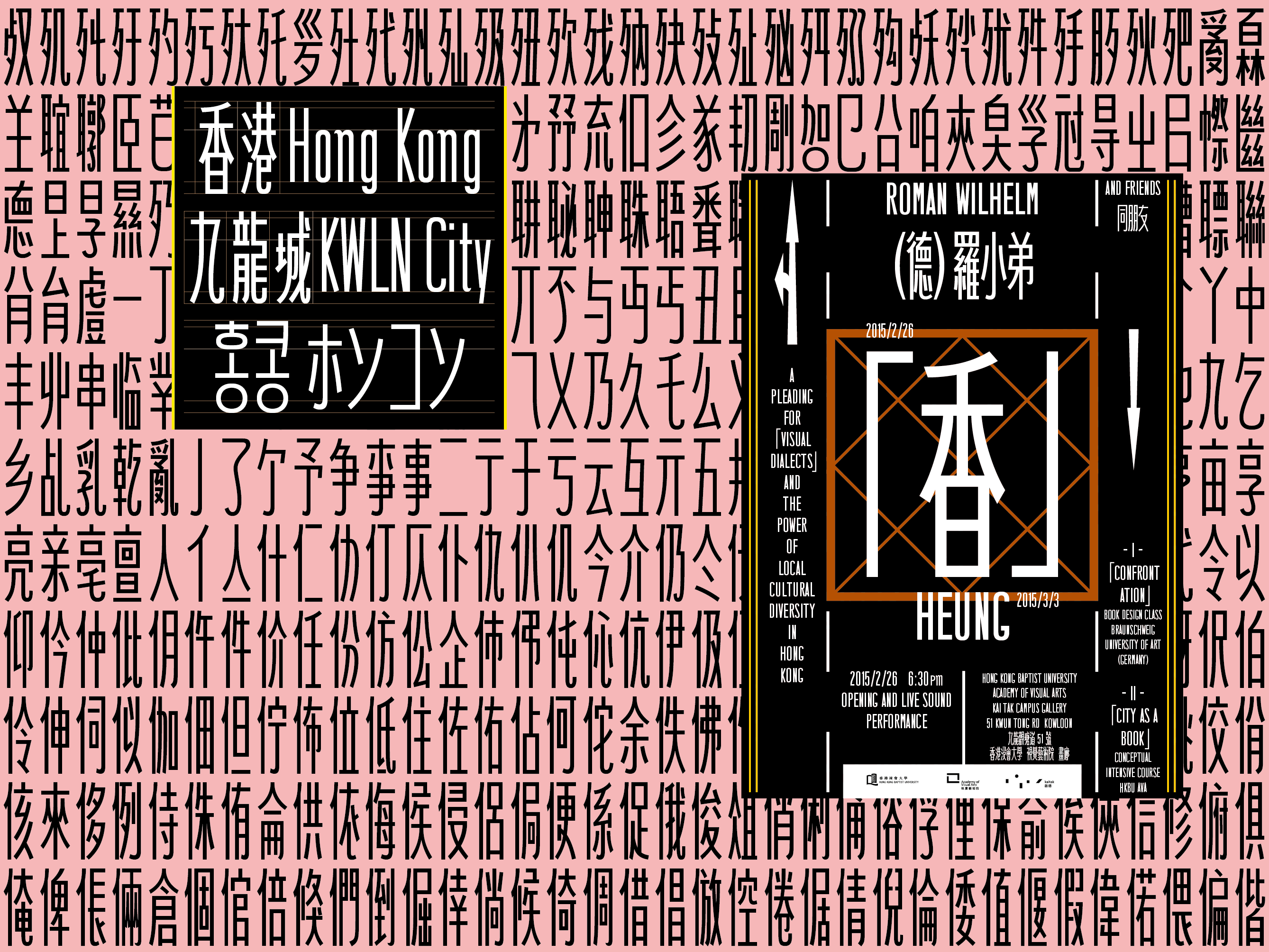
Hong Kong Street Face was initially designed for a
stand-alone project during Roman’s stay as an artist in residence at the Hong Kong Baptist University Academy of Visual Arts—an art school font if you will. Inspiration comes directly from the streets of Hong Kong and their iconic hand-made traffic markings that have become promonent as a background to countless footage from the 2014 Occupy and Umbrella movements, and none the less from the 2019 democracy protests.
Anyway, Hong Kong Street Face is an attempt to digitize a cultural heritage likely to disappear in the future—a kind of urban calligraphy.
Since 2016, the font-in-progress can be licensed on-demand by
3type (Shanghai).
Get a license here:
3TYPE
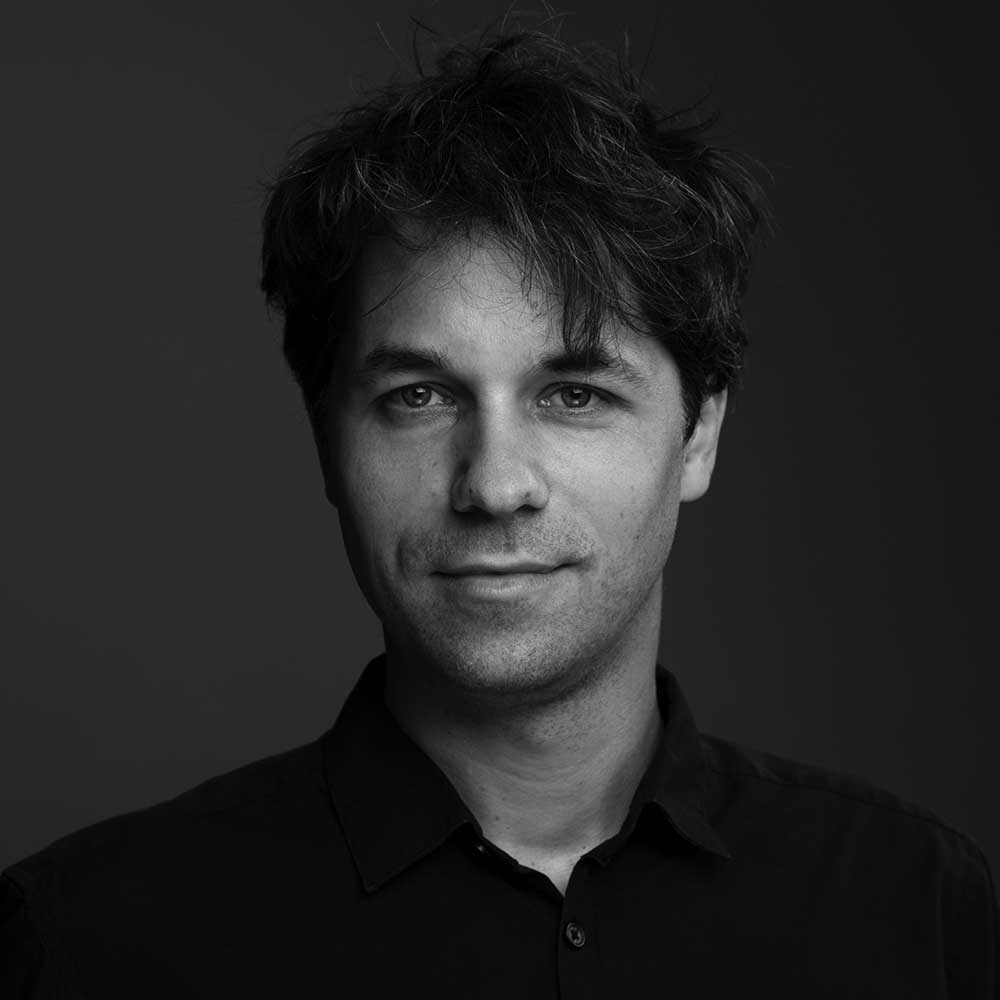
Roman Wilhelm studied typeface design under Fred Smeijers at
Leipzig Academy of Visual Arts and was a member of the
Multilingual Typography Research Group led by Ruedi Baur at
Zurich University of Arts. A fluent Chinese speaker, he has spent lots of his professional life in Asia. In 2018 and 2019, he was a substitute professor of typography at
Braunschweig University of Arts. Find out about his projects as a communication designer and researcher on
roman946.de.
All content © by Roman Wilhelm as of March 2020.
roman (at) roman946.de
